Liquid Lab
A juice company for fitness fanatics
While studying Visual Design at General Assembly in San Francisco, I was tasked to design a landing page for a fictitious pressed juice company. In designing the interface for the page, I also defined the brand language and experience.
After identifying the audience and competitors, I developed mood boards that would attract users and separate Liquid Lab from its competitors. The landing page design was further informed by composition, color scheme, and type system that is further reinforced the company’s objective statement:
“To be the pressed juice brand that fuels athletes and fitness devotees.”
How one might design a visual system that reflects the company’s goal of being the top juice brand among athletes and individuals with fitness goals?

The competition
Liquid Lab is up against companies like Liquiteria, Pressed Juicery, and Blue Print. These sites are clean and uncluttered, showcase their products and ingredients in a bright and cheerful manner, with an emphasis on fresh produce and a healthy lifestyle. Liquiteria takes a more playful approach in their font choice, taking inspiration from the liquid and refreshing properties of their product.
Because many of these visual systems are typically designed to promote the product, I saw this as an opportunity to differentiate Liquid Lab by designing based on the audience’s needs and goals rather than appealing to a broader audience.
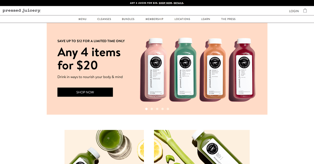
Pressed Juicery
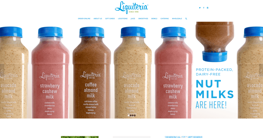
Liquidteria
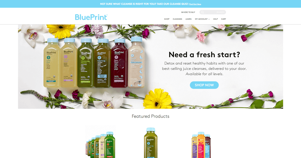
BluePrint
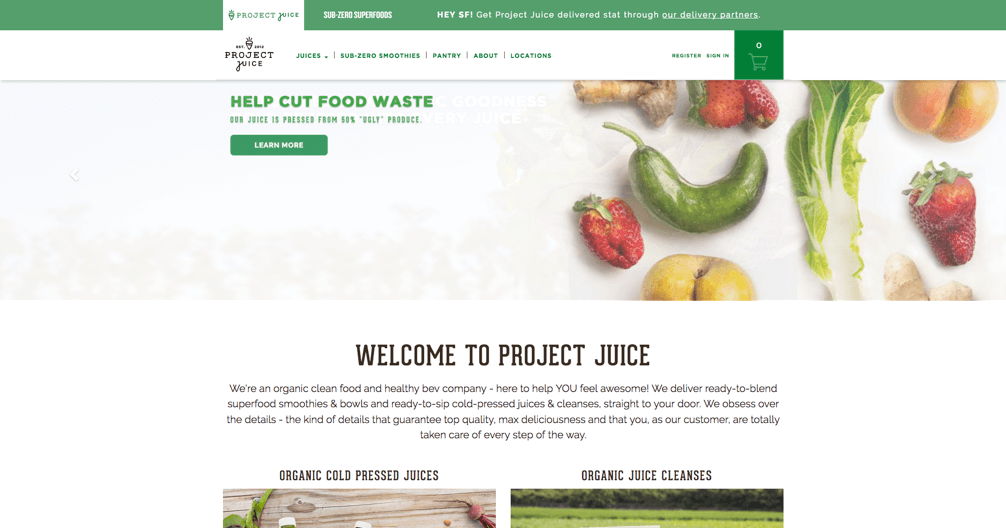
Project Juice
Audience survey
The targeted audience for Liquid Lab are athletes, and those committed to improving their health. They have goals along the lines of managing their nutrition as part of their weight loss, muscle gain, or endurance program.
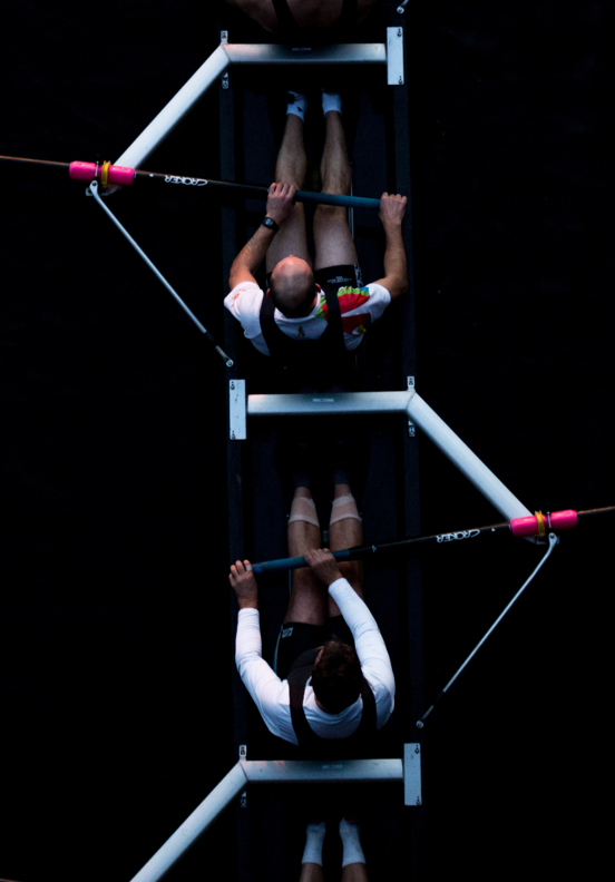
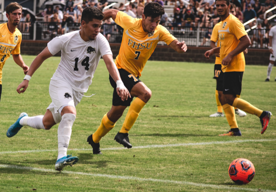
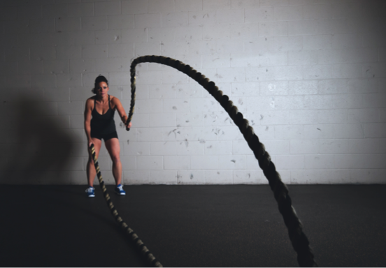
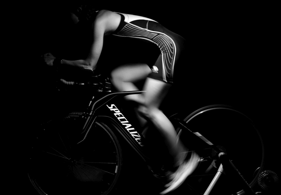
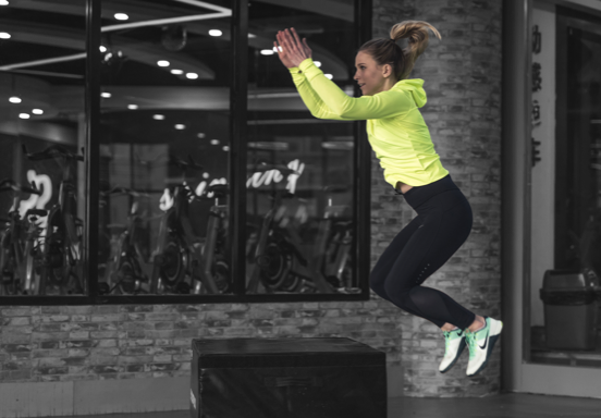
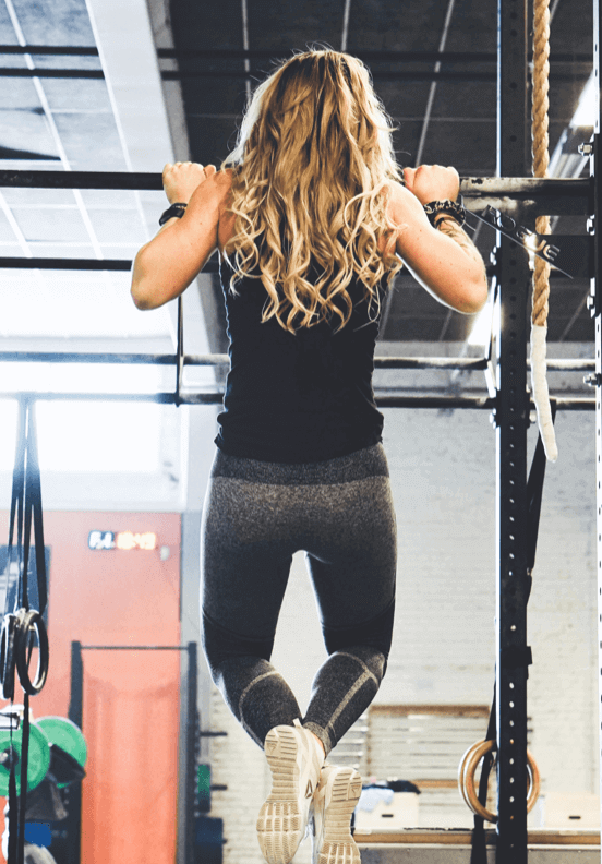
While researching types of websites the target audience would frequent, I found common themes were boldness, strength, toughness, and movement. A common pattern was the use of bold, all-caps sans serif font in its headers. Accent colors are often a high-intensity primary color. In addition to the bold typography, the imagery used in the sites surveyed often showed a strong, focused athlete exercising. These sites conveyed willpower and perseverance in sports. Some also included props to reinforce the movement in a static image. The sites are informative and masculine but also offer inspiration and encouragement.
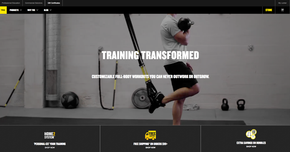
TRX
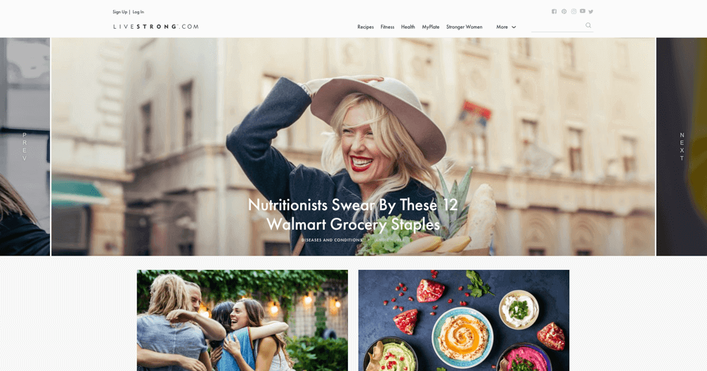
Livestrong
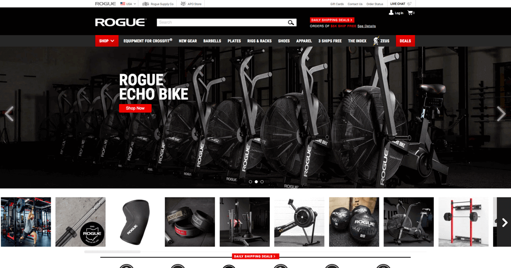
Rouge
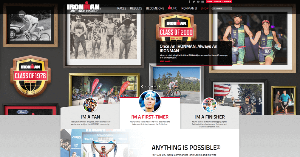
Ironman
Mood boards and key words
Liquid Lab’s design language is inspired by its athletic and physically active audience, pursuing a strong, energetic, and active aesthetic.
Color Palette
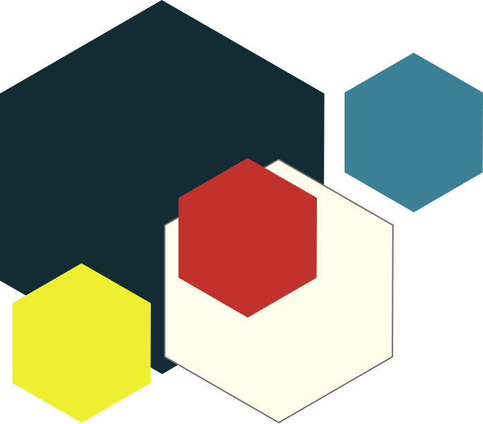
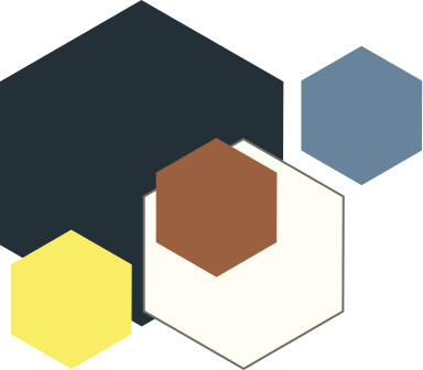
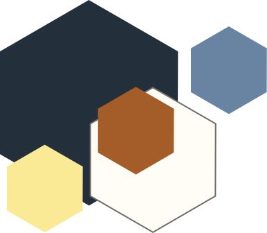
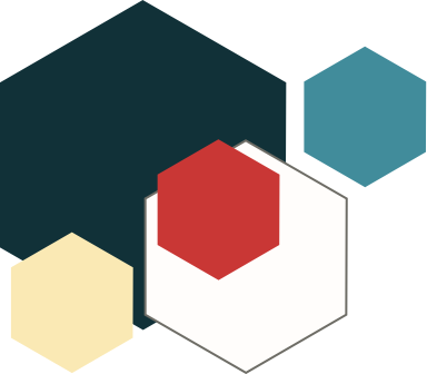
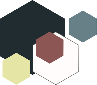
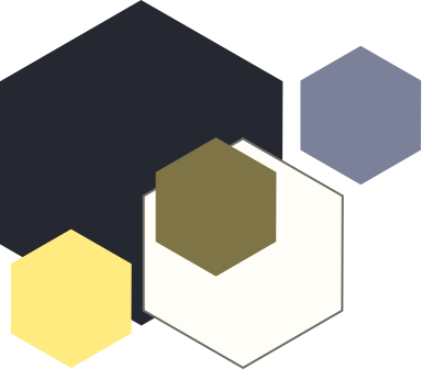
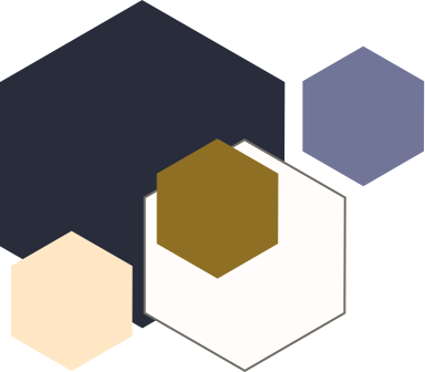
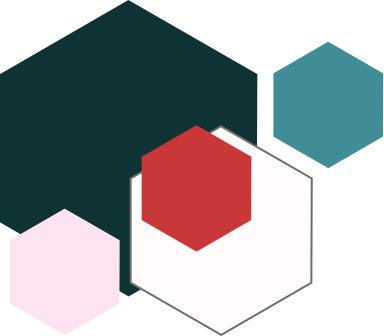
The initial color scheme explored for Liquid Lab proved to be low contrast and difficult to differentiate when tested for different types of color blindness. A triadic color palette for Liquid Lab was ultimately landed on because triadic themes generate energy when situated near each other. Furthermore, blues, yellows, and reds are often used in sports teams which would resonate with the audience. The blue-black is strong and powerful and has a sense of authority. High-saturation red is used not only for the function of grabbing attention, but also create a stimulating effect, generate excitement, and appetite. An intense, saturated yellow adds additional energy while a low saturation yellow is used in place of white text to add a bit of warmth to the overall composition. These colors are very distinct from each other, making them easy to read for the visually impaired.
Protanomaly
Deuteranomaly
Tritanomaly
Blue Cone Monochromacy
Protanopia
Deuteranopia
Tritanopia
Achromatopsia
Typography
Continuing with the theme of athletics for Liquid Lab, the typographic choices echo characteristics of typefaces often used for team ports. The display font Oswald is geometric, sleek, slender, and authoritative. Roboto offers contrast against Oswald with its balanced proportions, elegance and ease of reading.
Oswald Semibold
A B C D E F G H I J K L M N O P Q R S T U V W X Y Z
a b c d e f g h i j k l m n o p q r s t u v w x y z
0 1 2 3 4 5 6 7 8 9 - = , . / ! @ # $ % ^ & * ( ) _ + < > ?
Roboto Medium
A B C D E F G H I J K L M N O P Q R S T U V W X Y Z
a b c d e f g h i j k l m n o p q r s t u v w x y z
0 1 2 3 4 5 6 7 8 9 - = , . / ! @ # $ % ^ & * ( ) _ + < > ?
Roboto Regular
A B C D E F G H I J K L M N O P Q R S T U V W X Y Z
a b c d e f g h i j k l m n o p q r s t u v w x y z
0 1 2 3 4 5 6 7 8 9 - = , . / ! @ # $ % ^ & * ( ) _ + < > ?
Low Fidelity Compositions
These low fidelity compositions were quick studies on how the guiding keywords manifested visually in the forms, flow, and overall tone. The geometric shapes were designed to direct the eyes to objects of interest while asymmetrical lines guided the page, created dynamism and energy. Object orientation was experimented with to create contrast and movement. A horizontally oriented and static page was also explored to communicate balance.

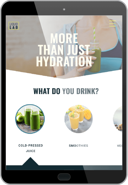
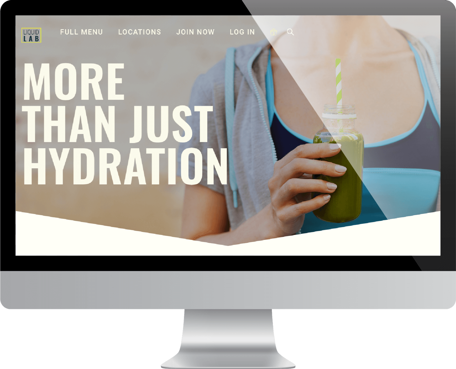
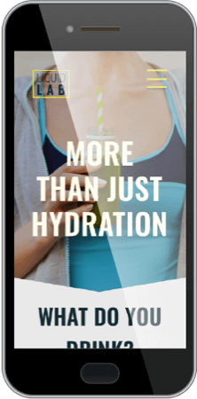
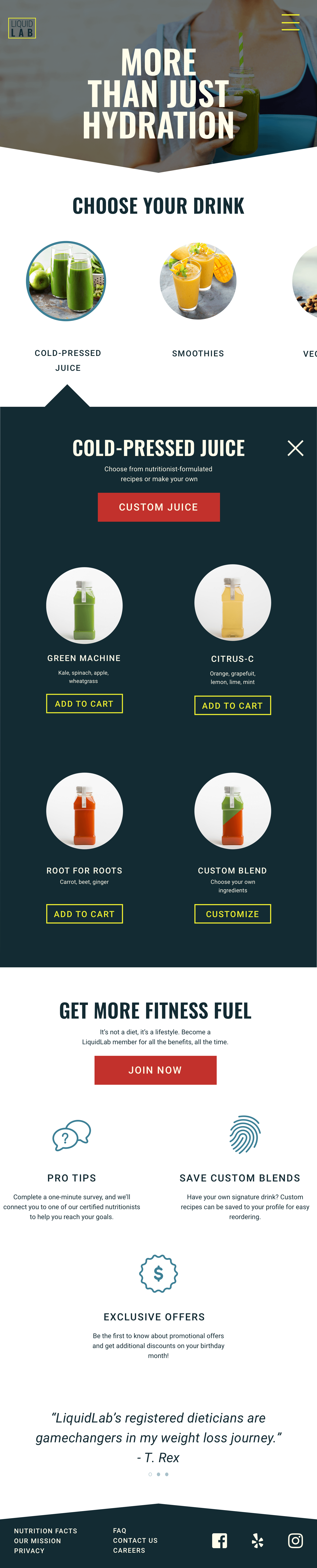
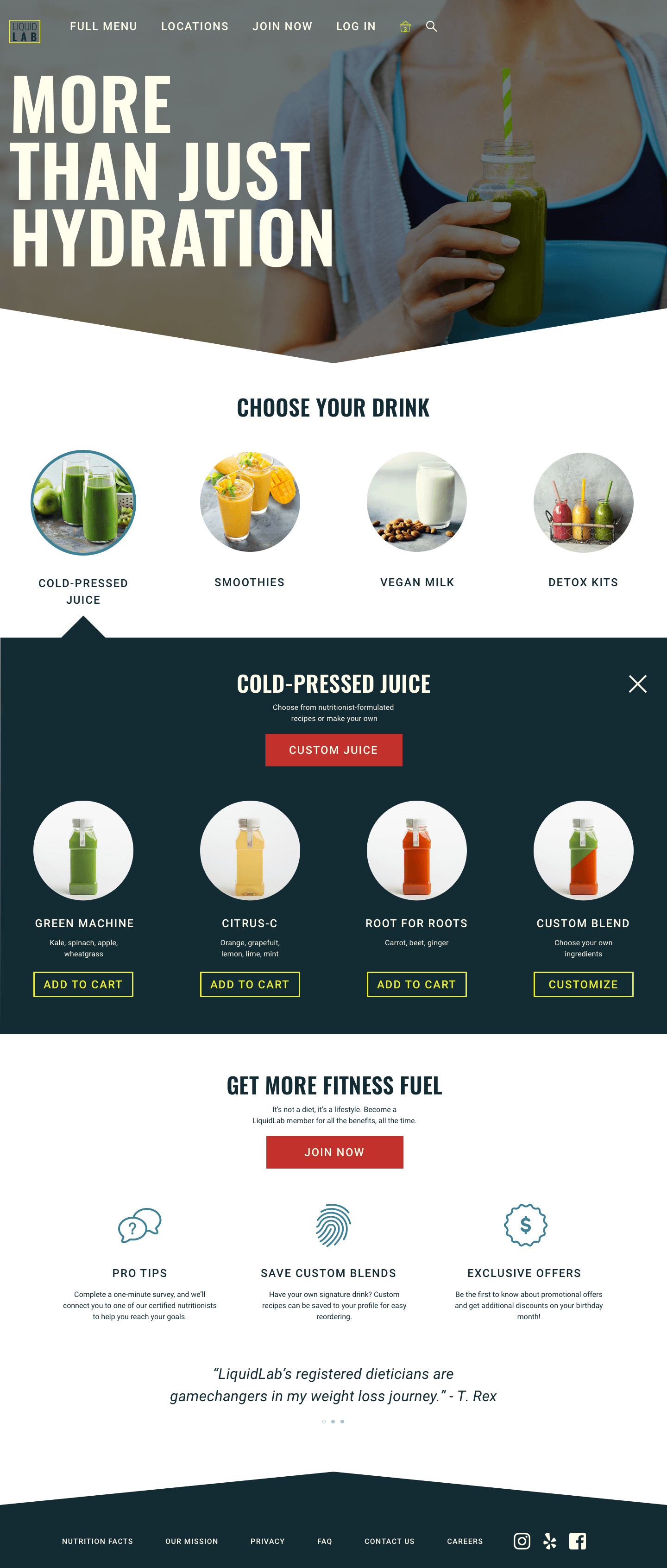
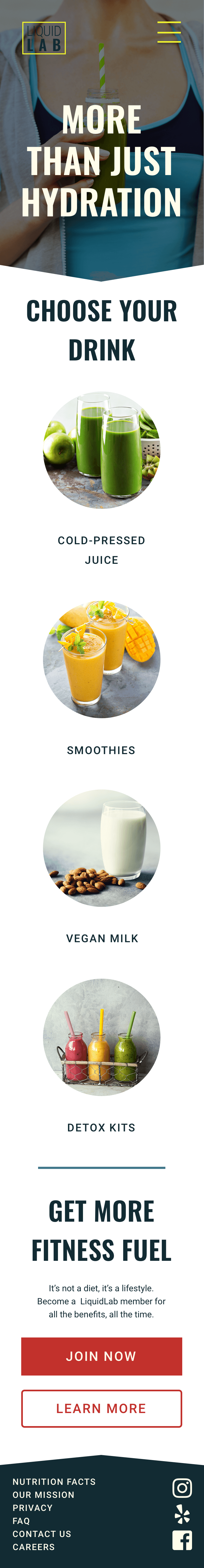
Final Designs
Select a device below to see its full design.
Lessons learned and next steps
As my introductory exercise in UI design, Liquid Lab touched on many of the fundamentals of design and was a exciting learning experience. Some challenges I faced include finding the balance between a unique composition versus one a common design patterns. With infinite possibilities in combining hues, values, and saturation, it was easy to get carried away while exploring color. The greater challenge for me was finding a set of colors that not only connected with potential users, but was also accessible. Choosing a set of fonts is similarly difficult. I spent hours sifting through hundreds of typefaces, studying their subtle differences, and agonizing over font pairings.
While this design exercise covered many of the basics of UI design, further steps could include button states, additional pages, interaction and motion design, user flows, and prototypes.
Other Projects