Betabrand
Reorganizing a product page
While shopping online for a dress, I noticed the product page I was frustrated with the way product information was delivered. Although the product itself was intriguing, some details felt like they were buried under a long scrolling journey of product photos. This is my attempt to reorganize and shorten the product page while keeping it on-brand. My goal was to reduce redundancy and present the product more interestingly. In theory, this would help make purchasing decisions faster and increase sales.

Before and After
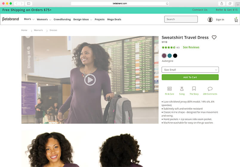
Placing a short animation above the scroll greets the viewer with the product in action and in context. An animation paints a fuller picture of how the garment fits, drapes, and moves. Removing the flattened text also improves legibility when scaling.

Before
After
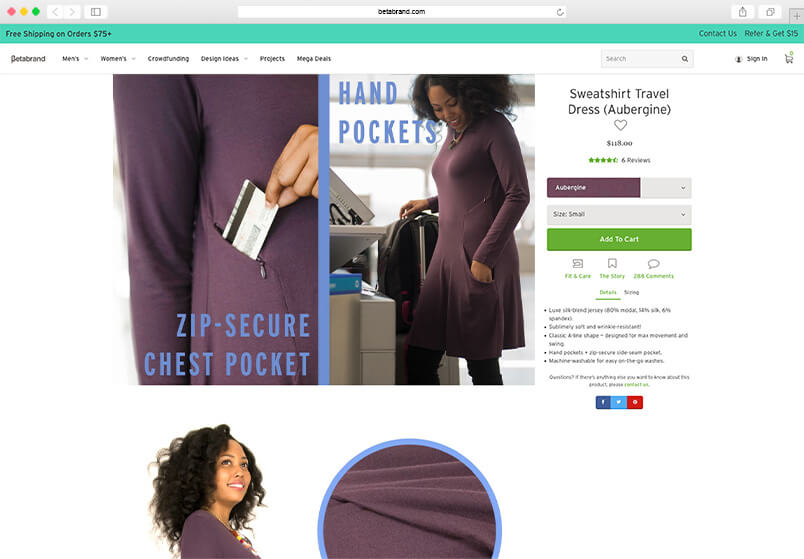
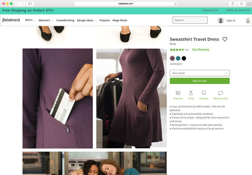
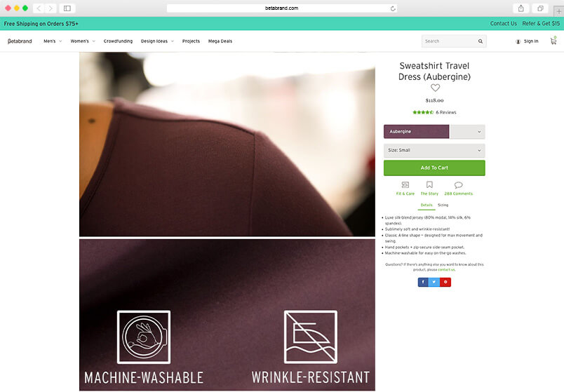
The use of appropriate images to highlight product features can speak for themselves. Removing low contrast, flattened text allows the viewer to focus on the message the images are communicating.
Before
After
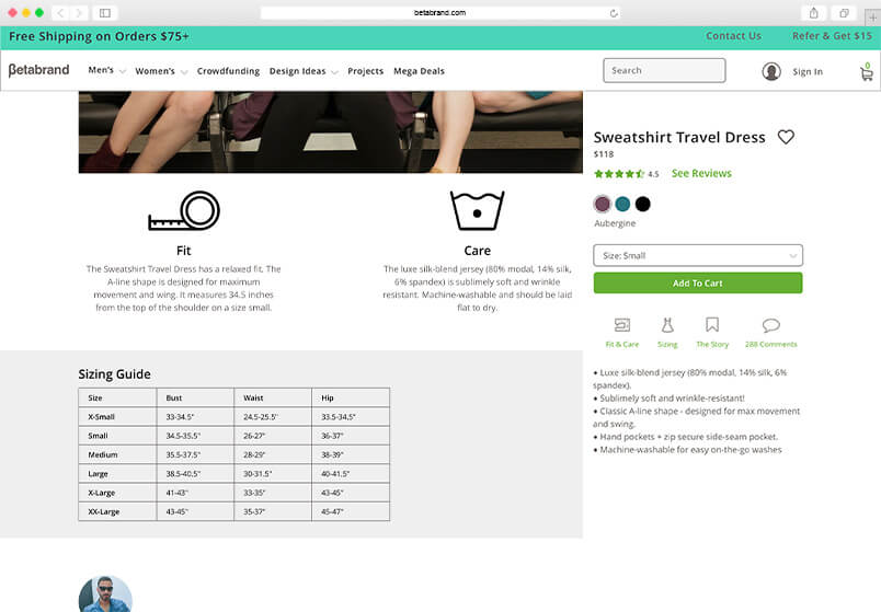
Keeping the page tidy with images that have an obvious message makes better use of decreasing attention spans and improves loading speed. Grouping two product features under a broader description makes room for adding information on product fit.
Before
After
