Vesta by Houzz
A fictional service to expand Houzz's portfolio
Renovating is a stressful endeavor. A few years ago, my husband and I had a horrible time renovating our home. Our experience was not unique, and I suspect homeowners who have had similar experiences have contributed to the rise and success of interior design and home renovation startups like Home Polish, Modsy, and Havely in the past several years. I saw this as an area of growth for Houzz, which is popular with property owners looking for inspiration, industry professionals, and products for their home. It is an excellent resource and starting point for anyone with a home project, but what about those who don't have the time to develop their ideas, research professionals, and manage the construction process?
Houzz is well-positioned to solve this problem by leveraging their existing database of home inspiration and network of industry professionals to offer a premium, concierge service to guide homeowners and coordinate the construction process. By expanding its portfolio of services, Houzz can help its customers develop thoughtful solutions, provide guidance through design and construction process, and keep projects on schedule and within budget

Survey
To test the demand for such a service and understand others' experiences, I surveyed homeowners I knew and asked them to distribute the survey to other homeowners within their social circles. The survey results revealed a diverse set of needs and expectations between homeowners, as well as varied experiences and overlapping problems this service could solve. Overall, people tended to hire general contractors to manage sub-contractors and settled on designs from online research and showrooms in place of hiring architects and/or interior designers.

"We struggled to find finishes we liked within our budget. We were not entirely confident with some things we chose, but I guess it all turned out alright in the end.”
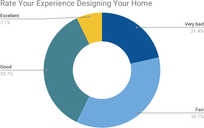
"We didn't anticipate staying in our home during construction would be as noisy and dusty as it was, and it was especially difficult when there was no access to a working kitchen for prolonged periods, and during intermittent water shutoffs."
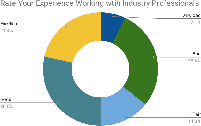
"We had a strong sense of what we wanted, but the contractor failed miserably in communicating and coordinating to the point that the job was poorly executed and fell months behind schedule."
Persona
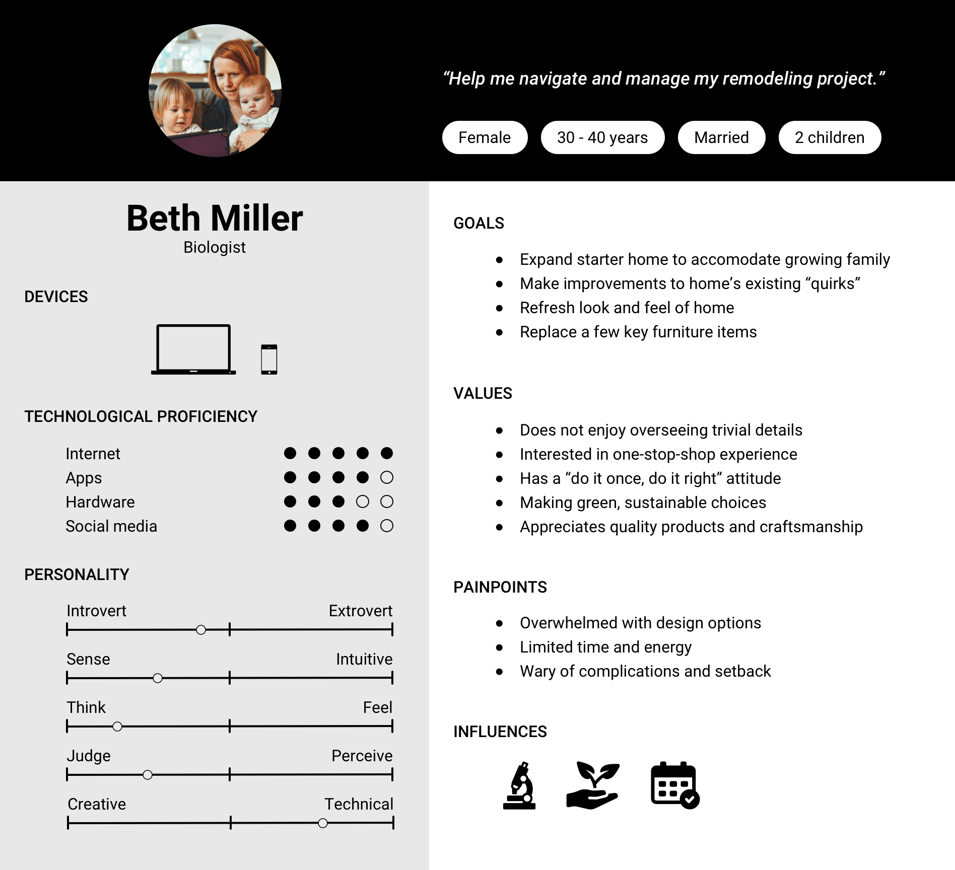
To help design for a target audience in mind, I created a persona detailed with profile information and user goals.
Inspiration
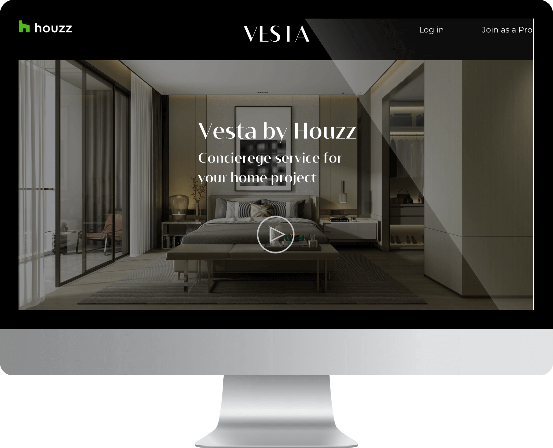
Since this service caters to those willing to pay more for a concierge design and project management service that would ensure a smooth sailing project, the user interface is designed to have a modern, luxurious aesthetic. I approached this with a simple and minimal design with dramatic contrast.


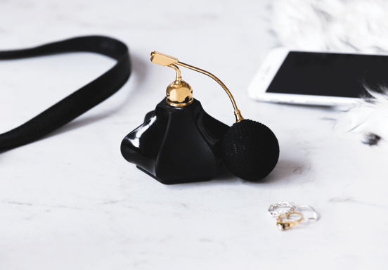
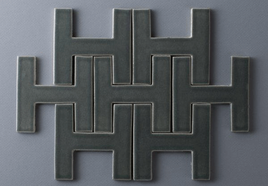
Photo by Fireclay Tile


Color Palette
The simple black and white color palette is dramatic, high contrast, yet elegant. The black lends a luxurious appearance, supporting the design direction, while the white helps create balance. Where black backgrounds are used, they give focus and hierarchy to its content, which is limited to images and videos.


Typography
Bw Vivant is used for title and header text. Designed by Moritz Kleinsorge & Alberto Romanos, it is a crisp, geometric serif font family with hints of art deco qualities. Its minimal styling and contrasting stroke weights express modern glamour and prestige.
Montserrat by Julieta Ulanovsky, Sol Matas, Juan Pablo del Peral, and Jacques Le Bailly is used for body text. It was inspired by typography that emerged in the Montserrat neighborhood of Buenos Aires in the first half of the 20th century, the same time art deco rose in popularity. Proportionally balanced with subtle styling, it shares similar proportions with Bw Vivant but at a more reading-friendly stroke weight, making the two a complementary pair.


Naming and logo
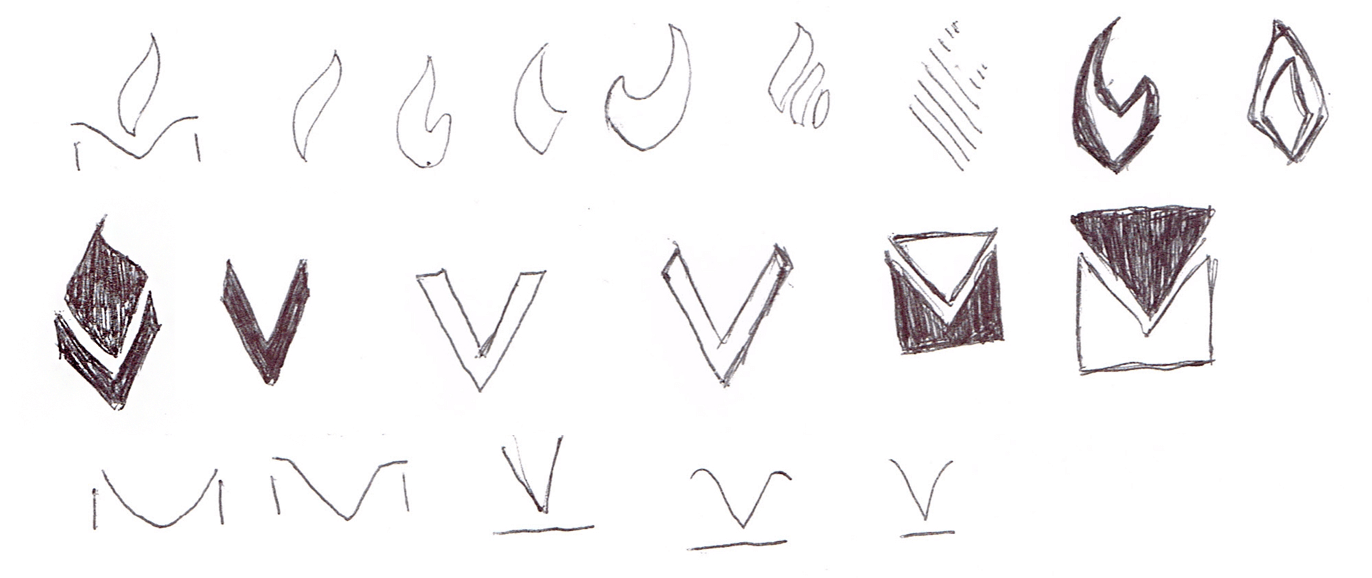
Vesta is named after the Roman goddess of the same name. She is the goddess of home, hearth and associated with household serenity. Since Vesta the service is meant to care for all aspects of the (re)making of a home, and giving peace of mind to homeowners, I thought the name was appropriate. Naming the service after the Roman goddess of the home has a prestigious ring to it and aligns with the design direction and the brand identity.

Sketches
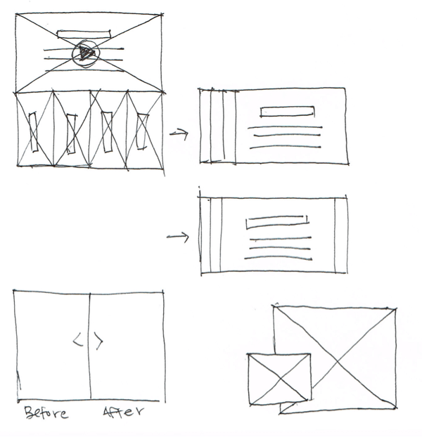
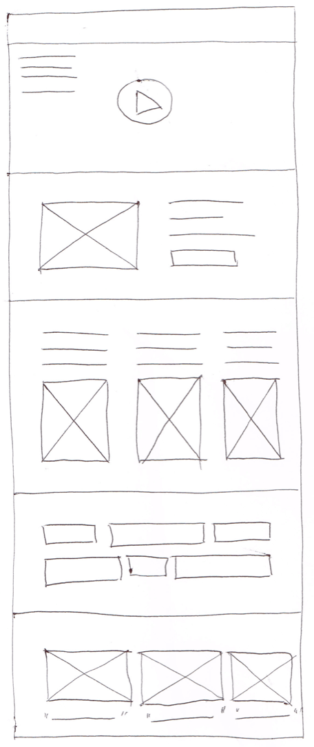
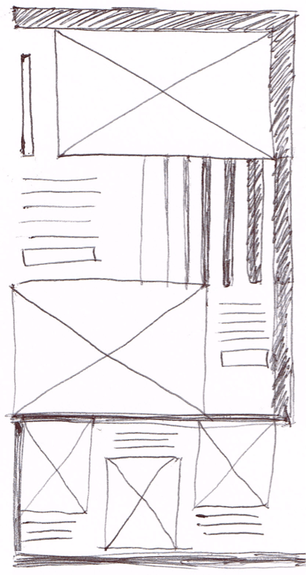
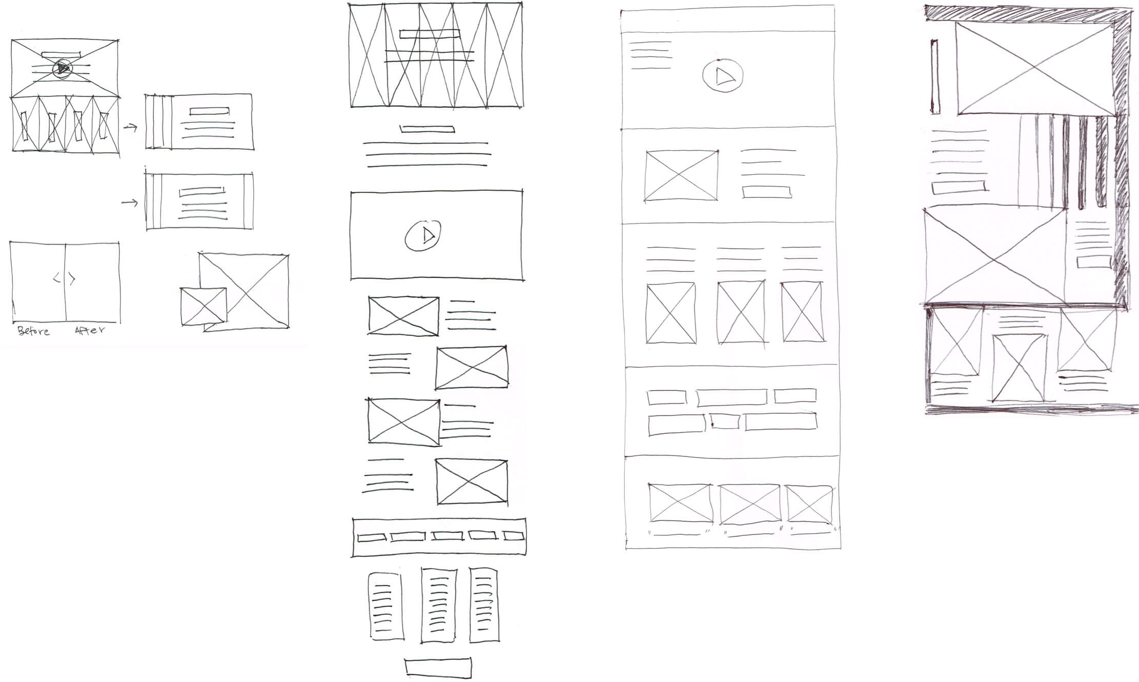
Composition and layout options were explored through sketches before the application of digital design tools.

Final Design
Select a device below to see its full design.
Lessons Learned and Next Steps
In my first experience experimenting with darker UI, I learned dark UIs should be approached thoughtfully. I was mindful to use dark backgrounds behind video and images only to enhance and dramatize the images’ effect, and to minimize text usage. One of the challenges of working with backgrounds was consistent text legibility and contrast.
To take the work further, next steps could include:
- Design onboarding pages should the user decide to become a client
- Design pages the client would use regularly, such as a dashboard to their project, communication with their assistants, marketplace to view partnering brands, displaying project progress.
- Comprehensive business model
- Mobile views or app
Other Projects

